
In the last 3 tutorials we created our timesheet ready to use; in this tutorial we’ll create a pivot table to help make sense of the information inputted into the timesheet. If you’d like a recap of the previous tutorials, please click the links: Part 1, Part 2 & Part 3.
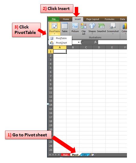
One of the best ways to view a lot of data is in a pivot table; it’s easy to set up and summarises data that you want to see. The first thing to do is set up the initial table: click on the sheet tab called Pivot which is an empty spreadsheet at the moment. Click on Insert on the ribbon and select PivotTable…
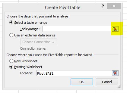
We now need to choose the data that we want to analyse – click on the pop out icon next to the Table/Range box…
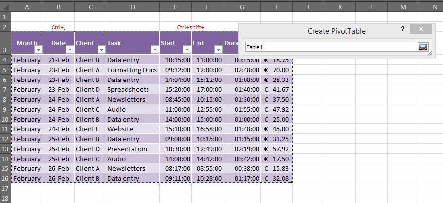
Then click back into the Main sheet tab and highlight the table from the start (cell A3) to the end (cell I16 in our example) – you’ll notice it displays Table1 in the box, this is the current name of the actual table…
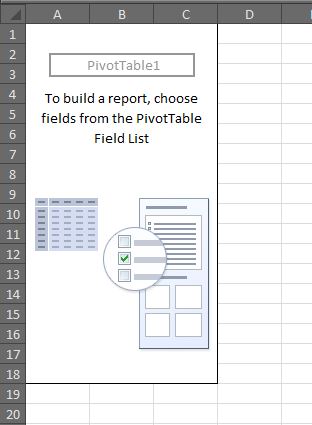
Click back on the pop out box and it takes you back to the Create PivotTable dialogue box. Existing Worksheet should be ticked for the location of the pivot table, and click OK. This then brings up a blank template of the pivot table for us to start choosing what we want to see…
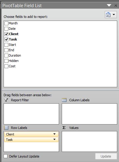
You’ll see on the right hand side is a field list of the table headers which we need to drag into the appropriate areas depending on what information we want to include. In this example we want to see the Client and the Task on separate rows, the Months in separate columns giving us the total hours value. Drag Client and Task down to the area called Row Labels…
Then drag the Month down to the Column Labels area, and the Duration down to the Values area…
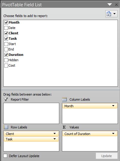
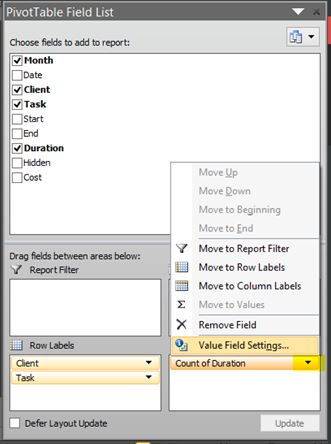
You’ll notice in the Values area it now says Count of Duration – this is no good to us as we want to see the total value instead. Click on the drop down arrow next to it and click Value Field Settings…
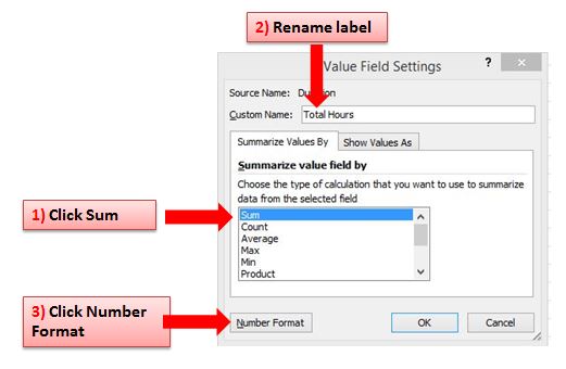
Then choose Sum, as we want to see the sum of the hours/duration. We can also rename the label to Total Hours. Finally we want to customise the format of the values, as it will be defaulted to General format which is no use to us. Click on Number Format…
Click on Custom and scroll down to [h]:mm:ss choose that and click OK. You’ll see the pivot table has now changed & looks something like this…
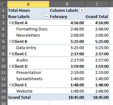
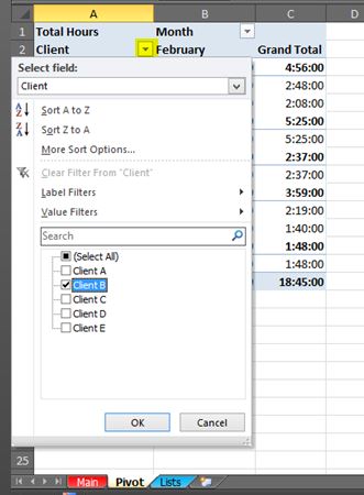
You’ll now see a summary of time spent on each client task for the month. You can edit the name of the titles e.g. change Row Labels to Client, change Column Labels to Month. If you don’t want to see the task for each client then click on the minus sign next to the Client name & it will minimise the information. If you only want to see one particular client then click on the filter arrow next to Client header, untick Select All, & tick the client you want to see…
It’s entirely up to you what information is relevant to you. To remove a field from the labels area click on the label and drag it back to the top (or untick the field from the list).
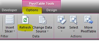
TIP: Remember that once you start populating the table on the Main worksheet, you must click back into the Pivot table, go to Options on the ribbon and click Refresh in order to update the data…
Have a play around with your pivot table & see the different summaries you can create. Next time we’ll be looking at pivot charts 🙂